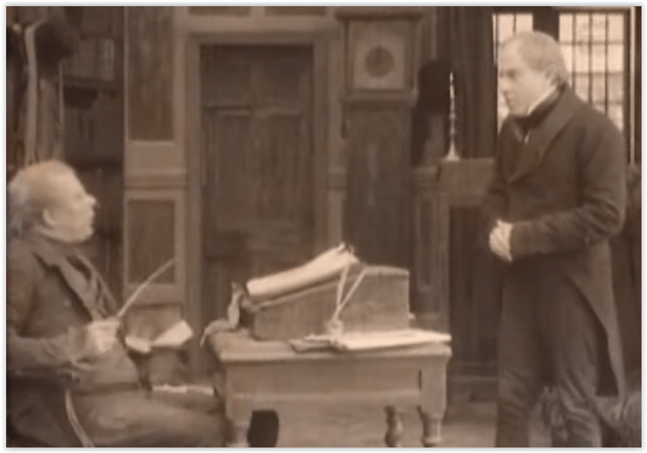
It has been suggested to me that, for a column about postcards which show dogs doing other things than urinating, there were way too many references to dogs peeing. I am sensitive to the comments of my readers, so I feel I need to show you a few of the postcards in my inventory which deal with dogs not peeing.
Folk studies have considered the dog very seriously, for our species has coexisted with the dog for millennia without ever quite making up its mind. Our loyal companion bears a name which for years was a nasty thing to call somebody. To this day societies for the adoration of dogs coexist with those who feel we need to improve by planet by eliminating all those mangy canines. With so many contradictions, it should not be surprising that the number of postcards dealing with dogs peeing should exist alongside those which deal with not peeing.
Mind you, we have no real details about what they think of our own methods of dealing with the problem, as seen at the top of this column.
:Let us deal first with the three hundred pound doodle on the couch. Any cartoonist who could draw a hydrant and a dog (and some who couldn’t) dealt with this notion.
In a fine old joke which didn’t make it into our joke quizzes, an eager cub reporter runs into the editor’s office yelling “Boss, boss! Big news!” The editor, tired of enthusiastic kids, grunts, “What? Man bites dog?” “No!” says the rookie, “But a fire hydrant sprayed one!”
Sometimes unfeeling humans set up barricades to a dog’s natural instincts.
What on earth is a dog to do in the face of such overt gentrification?
In truth, of course, most dogs will not have much of a problem with this little human folly.
When a dog has its eyes on a target, human ingenuity can only go so far in thwarting the process. (By the way, no one who has not walked a dog has any notion of how many muscles the smallest dog can develop when the right tree or signpost is involved. That yellow triangle that says “YIELD” is just advising the dog walker on the quickest solution.)
I mentioned the relationship of dogs and trees in postcards. Look closely here and you’ll notice the trees seem happy to see the visitor. (The hydrant is reserving comment.)
The theme is so prevalent in postcards that a dog being squirted by a hydrant just barely beats out the spectacle of a tree astonished to see a dog walk right past.
Although sometimes the dog has a reasonable explanation.
I hope this little essay about dogs not peeing has satisfied my readers. I find my supply of postcards on the subject has, for the moment, run dry.
Some time ago, we examined postcards featuring dogs and found that the number one thing our canine friends do in comic postcards is, well, number one. The number of postcards involving peeing pekes and poodles was so vast that there was an equal and opposite number of postcards featuring dogs who weren’t urinating just when you expected them to. (The whole series of dialogues between trees and passing pooches is worthy of a blog on its own.)
In all fairness, then, it should be noted that postcard dogs had pother themes. For example, as seen in the exceedingly weird card above, dogs could fetch. (Personally, I think she should throw that catch back: too small.)
But for sheer number of postcards, probably the second largest theme is the relationship between the dog and the flea. Dogs and fleas just went together in the cartoon world.
Although we get to see a lot of different dogs dealing with the problem, though, we do not get quite the same variety of gags.
Of course, if you can draw a cute enough puppy, the presence of the joke does not distract from the postcard.
For every person who bought a postcard because they liked the caption, there were ten who would write “Doesn’t this look JUST like old Truver after a long walk?”
You did see other jokes involving dogs at their second most popular pastime, but, oddly, most of the “scratching” jokes tended to be given to chickens. (Mind you, sometimes it was chickens AND puppies.)
Of course, part of the fun was that scratching in public, for humans, was considered vulgar. There was nothing like a joke where you could substitute a dog doing something you wouldn’t dare do in public. Which brings us to another much celebrated habit of corgis and collies.
This does, of course, bring us back into the ever-popular category of butt jokes. This variety, of course, was totally acceptable since, after all, dogs do these things.
Dachshunds were perfectly natural for this barely evolved species of humor.
Do you think that’s why so many people spend their time trying to teach dogs to shake hands? Would that be more socially acceptable?
Let’s change subjects, and ends of the dog. We will move completely away from the habit of butt sniffing if we note that dogs on postcards were frequently cited for having that cold nose.
Everyone knew about cold noses. That cool, damp nose meant your dog was healthy, no matter where he’d been poking it.
Cartoonists who focused on the nose of the doodle were, of course, far from making any jokes about other parts of the dog. And there’s an end for our blog investigation.
The original text of “A Christmas Carol has been chopped into 47 sequences, which form the chapters of this book. For each of these, we start with Dickens’s original. (Why 47? Well, I wanted to do an even 50, but the book won’t break down that way. It insists on 47.)
It has been a struggle, but I have resisted the temptation to change punctuation and spelling. English has changed more than a bit since 1843; we’re not nearly so comma-mad. My teachers would have slung a dictionary at me if I had been so free with colons and semi-colons. But this is the original text, and, as somebody or other once wrote, “my unhallowed hands shall not disturb it or the country’s done for.”
Following each chunk of text comes a brief summary of how the filmmakers regarded that particular sequence, and a discussion of how it was handled in each movie under discussion. The versions chosen for study in this book were selected for balance and variety. (Um, I actually just bought every version I could find available on videocassette in December. Just TRY to buy a carol in April. I ordered one in January and threw an entire warehouse into a tizzy. I finally got that video in August.)
Because titles vary from version to version, and can change between countries (England prefers “Scrooge” while Americans want “A Christmas carol”) each fi is referred to in the discussion by the name of the actor playing Ebenezer Scrooge. The films considered here are:
I.HICKS (“Scrooge”, 1935)
THE MOVIE: The 1930s gave us The Wizard of Oz as well as The Three Stooges. You can see bits of each here, along with an injection of Twenties Expressionist film. The version most easily available on videocassette is the one edited for television in 1946, and lacks about 18 minutes of the original film. There was a videocassette of the full version which, befitting cinema purists, is brighter, cleaner, and funnier, showing how the editors in 1946 did a masterful job tightening the movie but left out some of the fun. (2023 postscript: The one hour version is now much harder to find than the 78 minute version. The world turns around.)
HIGH POINTS: Seymour Hicks is a spectacularly idiosyncratic Scrooge, and one of the least aristocratic. He had played the role first on stage in 1901 and was the star of a silent version some twenty years before this first known talkie Scrooge. He took a hand in the script and direction of this version as well. Then there is that splendid Cratchit, Donald Calthrop, possibly the closest anyone ever dared come to the Cratchit Dickens produced in his live readings of the story. And for talking purposes, there is that amazing sociocultural section as the Lord Mayor’s household prepares for the official Christas diner.
LOW POINTS: These are the cheapest special effects this side of a middle school media class, and the sorriest set of ghosts ever. By gum, no Jacob Marley was going to upstage Sir Seymour Hicks.
II.OWEN (“A Christmas Carol”, 1938)
THE MOVIE: An MGM B-movie, this was designed to knock Hicks off screens at Christmastime in the U.S., and it did. Sterling British character actor Reginald Owen appears as the most querulous of Scrooges, who winds up partying with the Cratchits on Christmas Day like a man moving joyfully into a second childhood.
HIGH POINTS: There never was such a rollicking batch of Cratchits. Tiny Tim looks as if he might crumble before our eyes, and Bob is pitiable if portly, but the rest of the family (including June Lockhart in her film debut opposite her parents as Mr. and Mrs. Cratchit) are suitably but bearably lively. And then there is Jacob Marley, one of the most creepily corpselike ever to menace an Ebenezer.
LOW POINTS: If the picture benefits from MGM production standards, it suffers some of the scripting flaws of Golden Age Hollywood as well. The film runs barely an hour, but finds time not just to underline plot points but ring them with neon and blare them with trumpets. These Cratchits are also some of the most well-off, with a home worthy of Judge Hardy ad Andy. Fred has been made a bachelor to beef up his subplot in case Dickens’s story wasn’t enough to fill the hour. And the attempt to make Owen look at least a generation older than he actually was doesn’t quite come off.
III. SIM I (“Scrooge”, 1951)
THE MOVIE: For many people, this is THE Carol. Screenwriter Noel Langley (“The Wizard of Oz”) went farther than most in including material Dickens neglected to provide.
HIGH POINTS: Alastair Sim himself, of course. His Scrooge is utterly unrestrained; even when he is subtle, he is WILDLY subtle. He carries you by force of will through all Scrooge’s ups and downs.
LOW POINTS: Except when he is whining about being too old to change his ways: what was the point of all THAT business? And Marley’s deathbed repentance fails to move me (despite being another great scene for Sim.) These are minor quibbles; this production, even if you have to watch a colorized version, is top of the line.
IV. MARCH (“Shower of Stars: A Christmas Carol”, 1954)
THE PICTURE: This took over, in many US markets, the role of definitive television broadcast Scrooge from Hicks. It featured Frederick March and Basil Rathbone in a script by Maxwell Anderson, with score by Bernard Herrmann (before he started scoring for Alfred Hitchcock movies and episodes of the Twilight Zone.) The readily available videocassette of this reverses a trend, being a black-and-white version of a television program made in color.
HIGH POINTS: Nice touch, as well as economical, to have the same actress play Scrooge’s lost love AND the Ghost of Christmas past, while nephew Fred’s actor makes an excellent Ghost of Christas present.
LOW POINTS: But where is the Ghost of Christmas Yet to Come? Bob Cratchit is little more than wallpaper here, and given a choice between story and more songs, the production goes for the songs every time. And what, um, was the purpose of giving Frederick March a fake nose roughly eleven feet long?
V. RATHBONE (“A Christmas Carol”, 1959)
THE PICTURE: This was part of a television series called “Tales From Dickens”, in which Frederick March hosted half hour adaptations of full novels.
HIGH POINTS: Er, it certainly is individual. More of the story makes it in that you’d expect from a half hour production. And it has Basil Rathbone, so how bad could it be?
LOW POINTS: Well, that depends on your definition of “bad”. This is staged like a cross between a silent melodrama of 1914 and a particularly unenthusiastic episode of The Twilight Zone. Whether those sets are meant to be surreal or just really really cheap is a matter of opinion, and as for the story, it’s a perfect example of what happens when you hand over a classic to someone who feels nothing matters but the plot. All the decorative plaster is removed from the structure, allowing you to admire the framework and scaffolding.
VI.MAGOO (“Mr. Magoo’s Christas Carol”, 1962)
THE PICTURE: a made-for-tv cartoon by UPA, with Jam Backus’s Quincy Magoo as a Broadway star appearing in a musical version of “A Christas Carol”. This play is divided into five acts, roughly corresponding to Dickens’s five staves.
HIGH POINTS: I recuse myself. This was my first Scrooge, and try as I may, when I think of the Carol, I see this Jacob Marley, this Christas Past, this Christas Yet to Come, and especially these Ragpickers. More books than mine, though, call this the best musical version of the story.
LOW POINTS: The cut-and-paste here is ruthless as whole scenes and characters are moved about willy-nilly. The most obvious example has to be putting the Ghost of Christmas PAST AFTER the Ghost of Christmas Present.
VII.HADDRICK (“A Christmas Carol”, 1969)
THE PICTURE: An Australian animated version aimed at the Saturday morning TV crowd, featuring the voice of Ron Haddrick in the first of his two animated Carols. Visually, the adaptation is free, but textually it clings to the original words, adding mere bits of business here and there.
HIGH POINTS: Some of the added material is not unamusing, and he get one of the flintiest, most heartless Ebenezers on screen ever.
LOW POINTS: What DID the artists have in mind? Most characters are buck-toothed buffoons, particularly Fred. Jacob Marley looks like nothing human, though Scrooge recognizes him at once. The colors are sickly, and a pointless preview at the beginning shows us Marley’s Ghost, killing the suspense later on.
VIII. FINNEY (“Scrooge!”, 1970)
THE MOVIE: A musical from the people who gave us “Oliver!”, this was intended as a similar lush Victorian romp. The critics were largely unkind.
HIGH POINTS: The music is lively, the Musical Fantasy Early Victorian London is colorful and jolly, and the material added to the original story is pert and fanciful. Christmas Past and Christmas Present are magnificently solid spectres, both of them mildly astonished to find themselves associating with someone as petty as Scrooge.
LOW POINTS: If you like your literary creations dead serious, Albert Finney and Alec Guinness as Scrooge and Marley will be a sore trial to you. Scrooge occasionally comes across as Mr. Hyde by way of Richard III and possibly Quasimodo. He is the wildest Scrooge outside of Alastair Sim, which is not to all tastes. (And one of the few who could play both the present day Scrooge and his younger self.)
IX. SIM II (“A Christmas Carol”, 1971)
THE PICTURE: Winner of an Oscar as Best Animated Short Subject for 1971, this cartoon was made in the grim, swirling fantasy style very popular at the time. Not only does it attempt to be true to the original text as far as time allows, it brings backs the performers of Scrooge and Marley from Sim I, and reuses some other key imagery as well.
HIGH POINTS: This animation style is well suited to the darkest, grimmest parts of the story. The dark house Scrooge inhabits was never darker, the Ragpickers never more verminous.
LOW POINTS: It’s a short subject, and moves far too quickly, lopping out a great deal just to bring the picture in under thirty minutes. (Still, it is the best half-hour version out there.)
X. MATTHAU (“The Stingiest Man In Town”, 1978)
THE PICTURE: This was an animated revival of the 1954 TV musical of the same name which starred Basil Rathbone. It abbreviates script and songs, and recasts everything with the twinkling touch of Rankin-Bass, makers of some of the most memorable of TV holiday specials.
HIGH POINTS: This is a jolly Carol. Matthau’s Scrooge gives us a pretty good hint of how W.C. Fields might have played the role. The Rankin-Bass touch was not meant for gloom; bright backgrounds and perky people populate this version.
LOW POINTS: In 49 minutes, not only is the original story much abbreviated, but so is the script of the 1954 musical Subtle plot points do not have much place in a quick-moving cartoon tale.
XI. MCDUCK (“Mickey’s Christmas Carol”, 1982)
THE PICTURE: Disney characters assume the roles here, with Mickey Mouse as Bob Cratchit in his first movie role in nearly thirty years. This was Scrooge McDuck’s second movie appearance after decades in the comic books, and the last picture for Clarence Nash, who had done the voice of Donald Duck since the advent of talkies.
HIGH POINTS: Liveliness, certainly. Perky music. And a great source of fun, particularly picking out Disney characters in the background.
LOW POINTS: Thoroughly Disneyfied, this version retains perhaps a dozen lines from the original (And two of THOSE are “Bah, humbug!” and “God bless us, every one!”) It is also one of the few versions of the Carol in which The Ghost of Christmas yet to Come talks. I bet you didn’t know he was from Brooklyn.
XII. SCOTT (“A Christmas Carol”, 1984)
THE MOVIE: a lush and dramatic production, replete with authentic backgrounds and moody effects. George C. Scott is a hefty self-satisfied Scrooge, who takes a LOT of convincing before he realizes he is not just the model of a proper British businessman.
HIGH POINTS: It takes some getting used to, but once you’ve accepted George C. Scott’s face (certainly the least like Dickens’s description of Scrooge than anyone except maybe Mr. Magoo), it becomes the focus of the story. It twitches. It grimaces. Even before the reformation , it smiles a WHOLE lot. And it is as classically constructed as the Victorian buildings behind it.
LOW POINTS: It is a cold, hard Christmas, isn’t it? Every character in this production seems to exist solely for the purpose of lecturing Ebenezer Scrooge. The Ghosts treat him with contempt, his nephew is hard and angry, and Bob Cratchit labors with an air of seething resentment. No wonder he’s dour: even his customers treat him to lectures about his behavior. You start feeling sorry for him long before the Ghosts even appear.
XIII. CAINE (“The Muppet Christmas carol”, 1992)
THE MOVIE: A mix of Muppets and men: as with Mickey Mouse’s version, part of the fun is recognizing characters you already know from other roles, even if Dickens did not make room for a boomerang fish act. It is the only musical version to include singing lobsters.
HIGH POIINTS: exuberance. Enthusiasm. The music bounces along, the dialogue is well-spoken. The social conscience of the Muppets is a good fit for that of Charles Dickens. Caine is a nicely cold and stony Scrooge, and there has never been a warmer Ghost of Christmas present.
LOW POINTS: Touches here and there echo the Mickey Mouse version. The Marley brothers are having an awfully lot of fun for two damned souls, and the ragpickers have been shortchanged. The Muppets are not all that well suited for the grimmer parts of the tale.
XIV. CURRY (“A Christmas carol”, 1997)
THE PICTURE: This animated version includes a star-studded cast in a story set perhaps fifty years after the time period of the original. Scrooge owns a dog named Debit, with whom he shares a Dastardly-and-Muttley relationship. Debit handles the slapstick in the early parts of the story but sits out most of the middle.
HIGH POINTS: Tim Curry is another particularly hard-hearted Scrooge. He sics Debit on the charity solicitors, and hurls lumps of coal at the carolers, then sending Cratchit out into the cold to bring the coal back. He has some great throwaway lines. There is interesting background action.
LOW POINTS: Why on earth assemble a cast like this and do so little with it? Whoopi Goldberg is a very restrained Ghost of Christmas Present, and Tim Curry is not allowed to be all that much more than a good Saturday morning cartoon Scrooge. The music is well-meaning, I suppose.
XV. STEWART (“A Christmas Carol”, 1999)
THE PICTURE: A made-for-TV extravaganza, with much period detail and an attempt to include as much Dickens as possible.
HIGH POINTS: London and Scrooge are properly served chilled, as here. We find less of an attempt to be picturesquely Victorian: a drab office in a drab building of 1843 has much in common with a drab office of today. A lot of thought has gone into the dialogue: Joel Grey is a warm, glowing Ghost of Christmas past, and Stewart makes Ebenezer Scrooge very much his own.
LOW POINTS: The Ghost of Christmas present seems almost TOO sardonic, too grim. And with all the work in special effects, couldn’t the Ghost of Christmas yet to Come have been a little more impressive?
It has been suggested to me that my notes on postcards dealing with the military, particularly during World War II, have not been fully representative. The Army, including the Women’s Army Corps (ch), is well-represented, but what about the Navy?
In fact, the Navy was considered just as rich a service for postcard humor, and humor generally, during the war. Movies tended to be made in California, which had a goodly number of naval bases, and while a lot of radio comedy came out of New York and Chicago, neither of those places was short on ships and sailors. (You may be thinking that New York is a logical spot, but Chicago? Well, it was the home of a major naval training base, possibly, as Donald Kaul pointed out about Iowa, it is, after all, about as far from one ocean as the other.)
So a life on the sea was considered pretty fair game. Some day, when I can do it without getting queasy, I will cover the whole subject of seasickness in postcards.
This can be countered by a stereotype often associated with people on long sea cruises: lifting a knife and fork is the most exercise some people were believed to get.
And if army life was associated by comedians and cartoonists with peeling potatoes, the Navy automatically made them think of swabbing decks.
HOWEVER, there was one chore sailors were connected with in the popular view even more than scrubbing. The soldier on leave had a reputation with the ladies, but for a sailor this was considered a primary function. People felt they went to sea just for a rest between romances.
In an America where men were being taken away for training every day, the sailor who had only one girlfriend was simply not doing his part to keep up morale.
There was that saying about having a girl in every port, or…you got that one, eh?
The tradition goes back to before the Second World War, of course. Once upon a time, the sailor, however much work it was, had the quickest mode of transportation to cities around the world.
I have been told that, given a choice, a lady of the evening who specialized in military encounters preferred soldiers, who tended to be so tired from marching everywhere that they fell asleep quickly, to sailors, who were rested up and had had all that time on a ship to make plans.
Not that there weren’t opportunities at sea as well.
The postcards covered all of this and, as you may have noted from most of the above, also reinforced the belief that the boys taken from their homes and put in uniforms to fight were having a generally good time. Even if life afloat seemed unnatural to most landlubbers, Navy men often, according to this frequently reused verse, came to realize it was the life for them.
Now, I have mentioned this is not a food blog, and have repeated that. Something I have not mentioned is that this is not, technically, a blog dedicated to reviewing vintage smut. But I have acquired three more comic books of the type I discussed in the space a while back, and I thought I should let you know about them, as most of you (yeah, I see you back there in the corner, leaning forward, eyes aglow. Stick your tongue back in your mouth.) are not going to be reading these.
And, anyway, writing book reviews of books which are only eight pages long is a beguiling way to pass the time.
I do not believe I mentioned in my previous discussion, that these are known as Tijuana Bibles, or simply “dirty little eight-pagers”. They seem to have originated somewhere around the 1920s, and flourished in the years as cheap duplicating machines were made available. Although the freer access to naughtiness in the Sixties pruned away a lot of the publishers (who found cheaper ways to make more money as porn progressed) they have never quite disappeared, with artists inspired by them still producing similar works today.
There is some variety in Tijuana Bibles, but they generally run along certain lines. You take a celebrity, sometimes two: these are most often popular comic strip characters (fairly easy to copy, as they are already two dimensional) or movie stars, and you then write a story exactly eight cartoon panels long. This should be as explicit as possible. Explicitness takes precedence over, say, drawing ability, writing ability, or credibility.
Take, for example, the title shown at the top of this column. The anonymous artist has made an attempt, at least, to make the faces in the story KIND OF resemble William Powell and Myrna Loy. But any Tijuana text worthy of its eight dirty pages knows the faces are not what you want to see. So in virtually every panel of the story, one or both of the characters are posed so their head is out of sight. This saves time in drawing so the artist can get bon with the story. (The word “story” is an exaggeration. The plot, as often happens, is taken care of in the first panel, where our two protagonists, who appeared as man and wife in the Thin Man movies, announce they’re tired of being married onscreen but never having sex, thanks to the movie oversight board, the Hays Office, run by conservative Postmaster General Will Hays. The next seven pages are all about what the readers wanted, “readers” being as accurate a term, I suppose, as ”story”.)
The second volume under consideration here is a little more attentive to the character of its hero, though it does not come right out and mention Jimmy Durante’s name. (There are Tijuana Bibles which make him Jimmy “Schnozzle” Durante, though the real Durante preferred Schnozzola.) The plot here may derive from Durante’s stand-up act, which involved long bizarre narratives. Schnozzle here simply narrates his souvenir album to a visiting damsel, showing some highly unlikely (and even mildly funny) scenes from his amorous past. These inspire the young lady, and if you think Schnozzle’s nose is not going to come into the story, let me reassure you. This scene on the cover has nothing to do with the story, but this was common in mainstream comic books and paperbacks of the time, too.
The cover of the third book also has no relation to the story inside, and it’s a pity, because although it is the best book of the three, the cover is naughtier than this space needs to be. The star here is a comic strip hero now largely forgotten, Pete the Tramp, part of a general flood of comic strip tramps in the early twentieth century, many following in the footsteps of happy Hooligan. (The comic tramp is an English staple, too, dating back to Hooligan’s much older cousin, Ally Sloper.) Comic tramps tended either to be audacious scoundrels or luckless losers. Pete fell into the second category: every time he thought he was winning, the world would smack him back down.
This little eight-page story is perfectly true to his character, giving us a wildly unusual story. Pete, amazed, is not only to be offered a good meal, but invited into the house to eat it. The plot thickens when his hostess opens a door and he spies a young lady disrobing. By the fourth panel, both women are naked and forcing Pete through a number of sex acts, keeping hi pinned underneath because all Pete wants to do is escape. He ends the story still hoping to get away, threatened with violence (or a bad pun) if he makes a break for the door. This is EXACTLY the sort of thing that would have happened to Pete in his real comic strip, had newspapers allowed such bedroom ventures.
One expects only cookie cutter stories and characters from quickie comics produced for buyers in a day when there was no Interwebs to offer naughty pictures, but even in a mere eight pages, the largely anonymous writers and artists could offer something surprising. Maybe that’s why the art form, if we may call it that, continues. These three are, in fact, modern reprints from the 1980s or thereabouts, produced for no purpose of historical research. So some perv…oh, right. I just wrote a whole blog about ‘em. Well, when I do it, it is historical research.
So we have come to the end of the serialization of another one of my bestsellers that no one ever bought, and which has become obsolete in the twenty years or so since I wrote it. It was an adventure to write Ranunculus to You in the Days when research demanded at least cabfare and a bus token, and it might be fun to do over now that I can look at four times the flower language books via the Interwebs. But, to revert to vegetable vernacular, I hate to chew my cabbage twice.
It may worry those of you who follow this column to see us finish off another book, but fear not! I have numerous books in my portfolio, and, fortunately, at least one more nonfiction bestseller I can serialize before I consider whether or not to resort to printing here some of my novels. You will have some time to brace yourself before I push you into the fictional worlds of such undiscovered classics as “If Life Isn’t Worth Living, What Is?” or “The Hands of the Hen.”
The book I will foist on you in the Monday blogs for a while now labors under several handicaps. I never got as far as acquiring the rights to any photographs involved, for example. But nowadays we have the Interwebs, and as the book deals with cinema, you can easily rush online and look at the movies I’m discussing, so that lack will not be felt TOO much. (Some of the movies were easier to buy on videocassette than they are now, for some reason. Life is like that: when one window opens, another one shuts.)
Another defect in the book is that I never got around to writing a deep, philosophical examination of the main theme of the book, which is the adaptation of books into movies. (I was honestly hoping my publisher would hire a Big Name—that is, someone who knows something ABOUT cinema—to write that.) I will summarize my thoughts on that subject now, just to give you a hint of what is to come.
I agree with a genius whose name I have unforgivably forgotten, who was asked by a reporter what he thought of what Hollywood had done to his book. This chap said his book was right over there on the shelf; no one had done anything to it. There was a movie made with the same title, and some of the book showed up in the film while other parts didn’t, but nobody had done anything to his book.
The basic fact is that a book is a book and a movie is a movie. A novelist can make eight months pass in three paragraphs, but you can’t do things so easily on the screen. (You at least have to fade from a green forest to a snowfall to show it’s winter now; even that takes more time than reading three paragraphs.) In the films I examined, one which worked very hard to put every word of the text onscreen was among the worst versions available. A scene that is fun to read may take way too long to watch. At the same time, scenes of great depth can be shown in a theater which would slow down the book if those nuanced movements of the characters had to be set out in words.
In short, a story can work in both media, but one needs to understand what works. If you have seen any really bad movie versions of your favorite books or awful novelizations of your favorite movies, you get this. That’s about all I have to say about that, which proves there are things you can do quicker in a blog than if a Big Name gets to expound on a subject.
Another shortcoming of the book is that it deals with, well, a kind of movie a LOT of people don’t like to bother with. I shall always cherish the remarks of one publisher’s volunteer reader, who wrote “I don’t know why anybody would even read this, much less BUY it!” I have seen reference books which rate movies give individual movies in this book a top rating, only to leave them out of a wrap-up listing the best films because, well, it’s That Kind of movie, and no one’s going to want to see it anyhow.
I had great hopes for this book. I honestly thought it would provide a new way of studying movies, and that other people would take the same idea and, using different movies, do the same sort of thing. Now the book is obsolete because other movies have come along in the (egad) twenty-four years since I wrote it. But maybe we can have fun with it starting next week. If not, I guess there are one or two other things you can look at on the Interwebs.
We interrupt our regular sequence of columns for a brief personal note. Yesterday marked the passing of Scottie Lampe, a black cat who served as Alpha in his household for seventeen and a half years, teaching bipeds when cats need to be fed (often), when cats need to be brushed (whenever they feel like it), and how much of the furniture belongs to the humans in the household (none of it.) One could go on, but we might as well close simply with the observation that it is amazing how short a period of time seventeen and a half years can be.
Despite what a lot of people say, there has always been a line to cross when it came to comedy. I have heard it said that the twentieth century was a dark age when all things were funny and nothing was too offensive to make a joke about. A lot of evidence for this comes from the comedy of the late century, when many comics declared straight out that if jokes were not offensive, they couldn’t be considered comedy. This is all a touch extreme. The line has always been there: there were jokes you could laugh at when you were among friends that you could not laugh at when out in public. The line just keeps moving as the world turns around.
I see this a lot when I go through the comic postcards of our ancestors, and watching that line move is fascinating. Butt jokes, as we have observed in this space, seem to be perennial, but laxative jokes seem to have largely vanished after mid-century. Ethnic jokes have wobbled for a long time between a celebration of a group’s unique ways and accents and being cruel mockery of the outsider. Jokes about sex were generally reserved for private use, but today I spotted a T-shirt in a dining establishment which, though it made me chortle also made me wonder why the manager didn’t ask her to put her jacket back on.
Now one thing that has become less publicly funny as time went on is the spanking joke. Spanking jokes were all around me as a child, featured in children’s comic books, shown off in dozens of cartoons and comic strips. There are hundreds of postcards on the subject as well. I think our ancestors regarded being spanked as a child to be so universal that the subject would appeal to a wide audience.
I have not, so far, discussed the subject here, though I have plenty of material to work with. It is not only considered offensive, but comes down in some people’s minds as outright pornographic. I won’t use this space TOO often to critique how other merchants of postcards advertise their wares, but there are those who try to sell these postcards by warning “Child Abuse Postcards” for sale, to let you know they disapprove (but apparently don’t want to die and have these found in their estate.)
So today I am not going to discuss spanking postcards. I am going to turn the subject around and discuss the opposite. Non-spanking postcards are all around us, and it bothers me that some of my competitors do list these as spanking postcards, offensively trying to make a buck on….wait, I’ve done that now and again myself. Forget that bit.
Some postcards are simply misfiled because of what they seem at first glance. The postcard at the top of this column shows an equally common sight of bygone days: a mother fixing the pants her kid just tore sliding on the sidewalk or climbing a tree. It’s sort of a visual pun: you need to look a second time.
Similarly, any hand raised near a person’s southern side can mislead the eye (and or an online customer.) This chap (who was reused for a similar card in which both are wearing swimsuits) is merely waving hello.
And so is this young lady, despite the fact that her presumed target is bare. (Babies with bare bottoms were once much more common, though they still appear, sometimes to raised eyebrows.)
This sort of thing annoys me, though I have made use of it myself. There is a difference between a “spanking” and a swat on the rear and then duck for cover, as this chap will have to do.
This was a wildly popular theme in postcards.
There is a whole world of postcards inspired by a now nearly forgotten music hall song “My Word, If I Catch You Bending”. The swift swat is considered in some circles to be peculiarly British humor.
We, fortunately, had the motto “Do It Now” to take the place of that song. Note that this sort of humor does not have to be a joke between two different sexes.
I would like to know how this particular twosome got onto so many different postcards. Was the same artist involved in all of them? Why the wishbone? Why the “Lest We Forget”? Do you see how much confusion we can get into when we consider the backsides of our ancestors?
Our ancestors also considered physical altercations between married couples to be funny (especially if the wife was winning.) Someday, perhaps, we will consider this phenomenon and study the evolution of the rolling pin through the years. This lady is using a much more easily wielded weapon (can’t quite tell what it is) and I have seen THIS described as a spanking postcard. Nonsense: she herself would simply call it “hitting” because she doesn’t care where the implement lands.
And it is the same thing here. I have seen this advertised as a spanking postcard, but her aim is off for that. This peeping tom is merely going to be de-peeped about the head and shoulders.
So there. I hope you benefited from this discussion of not-at-all-spanking postcards. You’re welcome.
Any language comes with its punctuation marks, intensifiers, and contractions. These seek to clarify but often confuse a novice in the new lingo. The language of flowers is no different.
The easiest modifier is simple numbers. To give “one perfect rose”, for example, indicates that you regard the recipient as your very ideal, one among millions as this rose is the one excellent example among many lesser roses. And to give a whole armful of red roses shows that you are so besotted as to go to considerable expense. Or that you have just won the Kentucky Derby.
Floriography, from the very beginning, included systems of modifiers. Mme. De Latour, and a number of her followers, indicated that you should give your flowers inclined slightly to the right if you want to indicate that the recipient is the subject of the message. If you want to give the opposite impression, you “reverse it”, though whether this means you incline the flowers to the left or turn them upside-down was never made perfectly clear.
That simple system was refined on by later floriographers, especially the Lover of Flowers, whose system is the one most commonly reprinted today. If your bouquet is tied so that it is toward your left, that is, toward your own heart, you are the subject of the message. Tied to the right, so it inclines toward the recipient’s heart, means you are saying something about the recipient. Or you can dispense with the knot and tip the flowers a little to the left to refer to yourself and right to indicate the recipient. Thus, a white lily tipped to your right means “You are all purity and sweetness”, while a white lily tipped to the left means “I am all purity and sweetness”. Turning the white lily upside-down (or, Lover of Flowers suggests, cutting the top off the plant) means “You are NOT all purity and sweetness”.
Now let’s assume you are the recipient of a flower. You have several options in hand. (Small joke there. Reduce speed to 25 mph.)
If the giver is expecting you to answer some question or invitation, you can hand the flower back with your right hand to say “Yes” or with your left hand to say “No”. If you’d rather keep the flower, some floriographers suggest you touch it to your lips for “Yes” or tear off one petal and drop it to the floor for “No”.
Sending a message by flower can be altered by how you WEAR the flower. If you put the flower in your hair, you advocate “Caution” as part of the message. If you wear it on your chest, or tuck it into your cleavage, you add “Remembrance” or “Friendship” to the message. But if you place it over your heart, you are seasoning the message with “Love”. Thus, putting a watermelon in your hair, would be telling your recipient “Beware Bulkiness”. What it would communicate to everyone else in the room, I hesitate to guess.
According to the Lover of Flowers, if you wear a rose on the breast over your heart, by taking it from that spot and handing it to someone, you are declaring “fervent or undying love”. Be warned, though, that the recipient is allowed to “reverse the rose” by handing it back upside-down, as an indication of “disregard and contempt”.
A special code for rosebuds has been listed under Rosebud in the text. There was a special code for marigolds as well. As you no doubt recall, marigolds express sorrow, grief, or pain. Where you wear one indicates just where your problems lie. Mme. De Latour came up with this and though the exact translation of her intentions varies from floriographers to floriographers, they more or less agree on the basics. Wearing the marigold on your head signifies that you are suffering mental anguish (“peine d’esprit”). If you wear it over your heart, you are suffering from the pangs of love (“peine d’amour”). If you wear it on your breast, you are simply bored (“ennui”).
How a poor sap is supposed to tell from across the room whether that marigold is over your heart or on your breast, I’m not sure. Maybe it won’t matter: most people won’t even know it’s a marigold. (Carole Potter suggests you stick it into your cleavage for “ennui”. That might help.)
Some floriographers go all out in explaining how you can combine flowers to create a sentence or whole paragraph. Much of this you could have come up with on your own: for example, mixing oleander with narcissus can warn “Beware of Egotism” (or, as mentioned, you could wear the narcissus on your head.) A few floriographers, though, developed special bouquet codes. These were, by and large, not picked up on by other floriographers. I thought you ought to know about them, just to make your cultural education complete.
Captain Frederick Marryat, a popular adventure writer now remembered largely for some good stories of ghosts and werewolves, put together a book called The Floral Telegraph in 1836. It’s a charming bit of nonsense, with a long fantasy tale about how the goddess Flora (or one of the goddesses Flora, but never mind) appears to a gent in his early sixties and explains, among other things, how she has worked to develop something more efficient than the language of the flowers. What she came up with is a system in which every flower corresponds to a digit, which can be used in one, two, or three digit numbers corresponding to phrases in three separate vocabularies (you tie a number of knots in the string of the bouquet to show which vocabulary the recipient should check.) It’s a hopeless sort of system, really, but the story is kind of fun to read.
George H. O’Neill really went to a lot of trouble to standardize modern flower language. He produced a brand new system of bouquet messages: not, he said, to detract from the originals but to serve you in case the flowers you needed for a particular message were out of season. The system leaned heavily on roses, pinks, and other plants any good florist would have on hand year round. It becomes extremely complicated: you’ll need to consult his book for all the details. What I liked best was his code for arranging clandestine meetings. One pink flower in the bouquet meant you were to meet on Sunday, two meant Monday, and so on, while the number of white flowers in the bunch gave the hour you would meet. Or you could include an envelope of petals: seven and a half, say, for 7:30. And if you wanted the recipient to phone you, you included a Canterbury Bell. (No, honest.)
He was actually following the lead of Henry Phillips, nearly a hundred years earlier. Henry developed a system for indicating any number from 1 to 1000, using a system of leaflet arrangement. (Henry seems to have been thinking mainly of artists putting secret meanings in their paintings.) He also suggested ways to twist tendrils for “a”, “an”, and “the”, and recommended a series of lotus designs to indicate days of the week.
C.M.Kirtland, or whomever she borrowed her flower language from, had a system more concerned with what was used to tie the bouquet. A laurel leaf twisted around the flowers meant “I am”, an ivy leaf “I have”, a leaf of Virginia creeper “I offer you”, a sprig of parsley “to win”, and an ivy tendril “my desire”.
But it was Fulvio Pellgrino Morato, back in 1545, who developed the most elegant system, as follows:
If the bouquet is tied in a spindle shape with nothing but linen thread, this intensifies the meaning, good or bad. A bleached string, however, does not affect the meaning. A black string intensifies all good meanings, and begs the recipient, if there is any doubt about what a specific flower means, to choose the very nicest meaning as the one you intended. Tying the bouquet with a hair from your head means your body, your heart, and all your goods are at the recipient’s service. Use caution with this one.
If you wrap the bouquet in green silk, you are reinforcing all the good meanings in the bouquet, declaring all possible bad meanings null and void. Tan silk does just the opposite, augmenting the nasty messages. Yellow silk will reinforce good messages, while blue and violet silk leave the messages alone. Red silk indicates you expect a favorable response. Flesh-colored silk is less demanding, saying merely that you HOPE for a favorable response.
This system allows you to send a nice bouquet even if some of the flowers you like have unpleasant meanings. Morato goes on to mention that since it is not always possible to get silk or string of the proper color, you can tie two knots in each end of the string to tell the recipient that the colors of the string and silk should be ignored in deciphering the message.
OR you could do as Rob Pulleyn suggests, and write down the message on the card that goes with the bouquet. Most floriographers would regard this as cheating, but do what you have to do.
ABOUT THE AUTHOR
Mr. Crawford is older than he used to be. He has spent his life wondering about things like, say, that filler in the newspaper on Valentine’s Day about flower language, looking them up, and just getting into trouble thereby. You should see his book on baby names. Somebody should. He is related to a number of scientists and nature writers, who rather regard him as the black sheep of the family. (He need binoculars to tell a cardinal from a carnation.)
Mr. Crawford does not especially like flowers. Say it with money.
I have mentioned before that I own a number of books I have no intention of reading, but preserve because they remind me of the person who passed them to me. Among the most readable is Anita Brookner’s Hotel du Lac, which was thrust into my hands by an irritated acquaintance, who said…..
Well, put that on pause while I introduce you to my friend, another person thoroughly loathed by a number of my other friends. She was tall, good-natured, and almost utterly without a sense of humor. She had a sense of fun, but jests eluded her. A teacher dedicated to students in one of the worst neighborhoods in the city–I heard a tour guide paid by the city tell passengers on a tour bus that “You can hear gunshots here at any time of the day or night.”–she felt that nothing was more dangerous, and yet more curable, than an inability to read. Over the years, she came up with a number of earth-shaking ideas on how to improve reading among students in underfunded schools. Among her principles were:
I.Stop Insisting That Reading Is Fun
That she herself thought reading was fun was irrelevant. Reading was an essential skill, and should be taught as such. Sugar-coating the message of “You must do this” with “You will enjoy this” led writers and teachers down fruitless and irrelevant paths. (It should be noted that she was extremely conservative in politics and religion, and used to take a bus early Sunday so she could attend a Black Baptist church far, far from the cheap hotel where she lived, because all the White Baptist churches seemed to her to be offering an illusion of easy passage to Salvation. Life had its fun, but you shouldn’t expect it in the things you were required to do.)
II.Stop Wasting Kids’ Time with Inessentials
She could NOT understand why weeks of useful time were lost teaching children the alphabet when they could have been learning to read. “You don’t require them to know the names of every part of the engine before you teach them to drive!” she explained. If you understood the sound made by an F, you didn’t need to know whether it was called f or that tall hook-shaped letter with the line across it. (In spite of this, she would teach the alphabet, and had harsh words for alphabet books with, say, a Goat and a Giraffe on the same page. Kids who needed to know what a G was should not be confused—until later—with a word that sounded as if it started with J.)
III.Include Students of Different Abilities
She wanted all her students to learn; where she taught, fast learners faced obstacles to education, as did slow learners, and average kids in the middle. But how did you bring the slow kids up to snuff before you bored the quick ones, or made the average ones start laughing at both? She envisioned textbooks with the same text presented three times on each page: in big type and short words for one set of students, in small print with longer words for the quick ones, and a base text in middle-sized print for the average students. Obviously, to present the same basic information in three different sizes on the same page meant that the smaller the print used, the more facts you could slide in. This might, she hoped, tempt the slow kids into reading the average kid’s text, and the average kids up into the quick learner’s world. Speeding up each child was her aim, wherever they sent her. (She was a substitute teacher who might be lecturing seven year-olds one day and twelve year-olds the next. The school system found her a little too weird for a steady job. Lemme tell you some time about her plan to teach Plato and Aristotle to first graders.)
She had her hopes and her expectations, but above all, she had her standards. Things ought to be done the right way, and she was not shy about letting people know this. Once she accosted a candidate for the State Senate and made sure he took a long article she had written about teaching children to read without the alphabet. He smiled and put the paper in a pocket, chatting about her theories, and allowing that she made some very good points. I doubt she thought he would read the paper, but the way he led her to think he might made her believe she had met a Democrat who should actually run for President Thorough Conservative that she was, she liked the way he handled a random pushy schoolteacher. (Whether he hung onto her essay so we will see it someday in the Barack Obama Presidential Library, I do not know. And she did not, alas, live to tell me how she voted that year.)
But, as I was saying, she had her standards and she DID read for fun. And one day, she brought me a book which was won the Booker Prize. She had never yet, she told me, read a Booker Prize winning novel she had liked, but this Hotel du Lac was a new low in disappointment.
:Here,” she said, pushing it into my hands, “You read this and tell me how YOU would have written the ending.”
I have not done this so far. But I hang onto the book in recollection of an interesting but misguided soul who thought I could write a better ending than Anita Brookner.