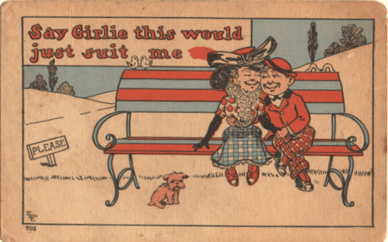
Our ancestors, to judge by postcard cartoon art, certainly were a gaudier lot than they seem in those black and white photos in the family album. We have discussed hereintofore the frequent appearance of checkered coats and trousers for men (the larger, the more likely). And as far as stripes and polka dots are concerned, the ladies were not far behind. Now, a little of this is simply accurate depiction of bygone ages. We like to ascribe to our ancestors outdated attitudes and dress, and our mind leaps to cartoon Puritans, in stark blacks and whites. But the artists had another reason for pursuing wild, variegated fashion.
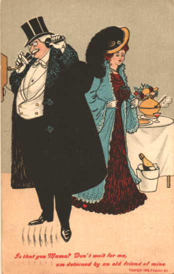
Working on a postcard provides only a small space, and the printers were not always to be depended on. Breaking up clothes with easily distinguished colors and patterns helps the viewer see what’s going on. A black suit and a dark (though not black) dress are separated by that light blue jacket, so the eye is not confused by the picture on its way to the joke.
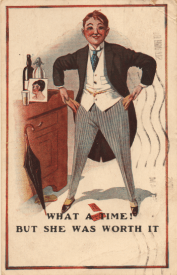
Accurate to the times though this may be, the artist has chosen this particular shade of trouser because it won’t blend in with the tailed jacket. The hero’s predicament is clear to us.

A line of men in identical suits would blend together, diminishing their plight. By choosing contrasting colors and patterns, they emphasize the length of the line.
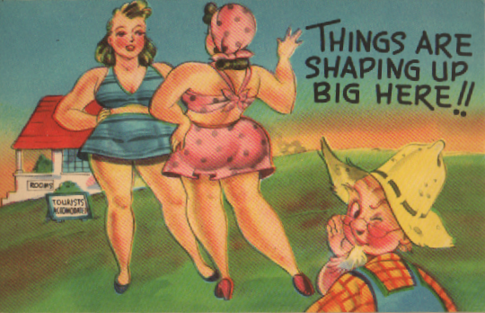
This farmer is wearing checks, yes, but our eyes go straight to the polka dots, and then on to the stripes. Solid colors, properly modeled, might have done the same thing, but solid colors can slip, if the printer is careless, or even be left out. The patterns are insurance, reassuring persnickety postal inspectors that the ladies ARE wearing suits.
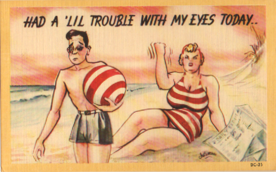
You can see for yourself the sorts of things that can happen if colors are too much the same.
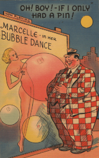
Postcard artists did, of course, also employ gaudy patterns to make fun of the wearer. This chap would have look smaller, somehow, in a plain blue serge suit.
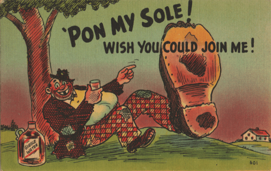
And, as we have noted aforetimes, the average hobo, tramp, or bum is frequently shown in stripes and checks, suggesting that such clothes wind up being worn by people desperate for any garment. (While, and at the same time, adding variety to the picture AND, in this case, emphasizing the wearer’s size. By the way, why are so many bums in cartoons so doggone plump? Do these overweight mendicants begging for food a remark about the Undeserving Poor, or just more fun to draw?)
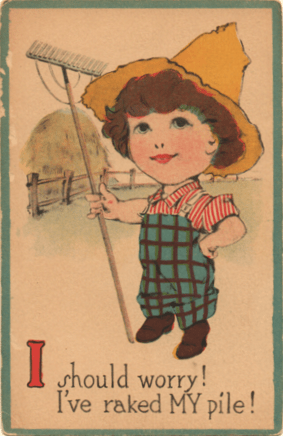
Farmers, it is hinted, wouldn’t know any better than to wear stripes with checks.
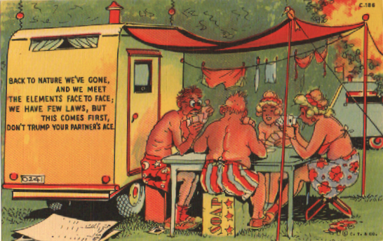
And here we are making fun of the back-to-nature bridge players by giving them gaudy lingerie. (Note how much detail Ray Walters has put into these undies, which, even if the color is accidentally left off, can NOT be mistaken for a nudist card party. As opposed to the young lady facing us, who is holding her cards in a way to lead us into doubt.)
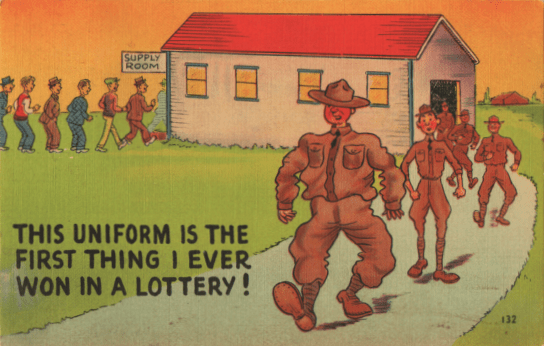
Here we have two lines of men, each in varied clothing. The IN line shows us various clothes to represent a certain diversity of the civilians entering the Army, but the varied outfits of those coming out makes a joke about the tailoring available in military issue outfits.
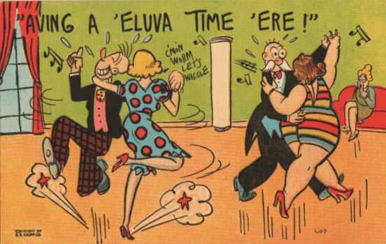
Sometimes, of course, the varied clothes is just a matter of self-expression. With only two couples on the floor, and so far apart, there was no real need to separate them with gaudy outfits. But it fits the artist’s bright cheery theme. Sometimes, as in the example at the top of this column, the whole point is just to brighten up the artist’s life, and provide a chance to show off something fun.

And, on that theme, we can end (so to speak) with this trio of interesting dress designs. No one liked drawing…female fashions like Walter Wellman.

