And so we come to April Fool’s Day. This is a holiday with a rich tradition of postcard-sending, but not so much in this country. As we have treated elsewhere hereintoforehitherto about the cheerful French tradition of fish postcards which combine April Fool’s Day with the old style New Year celebrations. So today we will consider the tendency of postcards to try to fool collectors with their variant printings.
This does NOT include cards like the one at the top of this column, as that’s a separate tradition of jokes being shared (so to speak) by different cartoonists. Nor yet do I mean cards like the one above, which can be as much fun to collect, as the original had a blank space where the town name was later printed. Anyone who likes this sort of thing knows that another previously unsuspected example with a town name seldom seen may turn up in a shoebox at a garage sale.
And we are not going to try to track examples where variations are obvious if one looks. This tradition of preprinting a jolly message on the picture side of the card turns up throughout history, and though it takes a second look to tell, there are a dozen or so different messages, which that second look can detect in the pictures and text (and color: Wyoming ones were red, Colorado messages blue or white, Montana yellow, etc.)
No, what we’re going to look at (and I know you were wondering) are the almost identical cards with one detail changed. The Mesquite Country Club apparently loved this photograph, because this large format postcard exists in at least three styles: one with the little white framing lines, one without, and one with soft focus around the edges. It’s that third example that shows a conscious decision to issue three different versions.
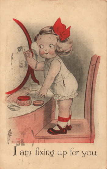
Some cases are less clear. This grown up beauty queen appears on some cards with no red coloring to her bow, socks, or jar lid. Was this an accident, or a concession to the rising price of printing in several colors?
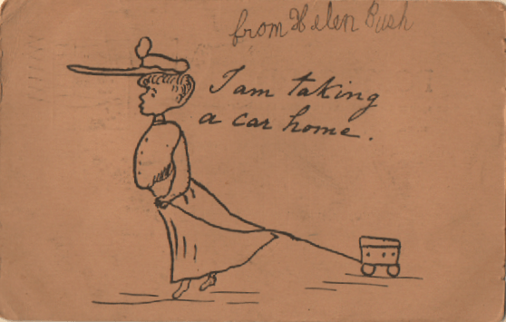
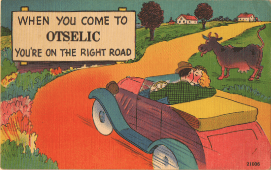
I think this one goes the other direction. This version of the lady with the car is the earlier one (in my theory) and the variant, where the car and her hat are colored in, were done later, when some editor said “If we’re going to charge a whole penny for this, we need to give the customer a little more.”
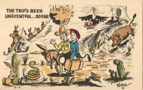
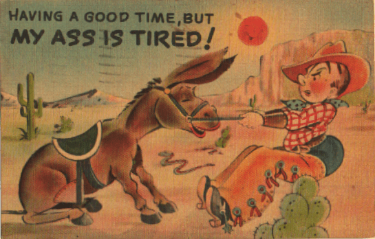
A lot of this went on at mid-century, as companies shifted from linen texture postcards to the quicker, cheaper chrome format. In some companies, the same design goes through changes in color as well as design: the picture gets simpler as time goes by. Bob Petley produced this card in a full color version, a black and white version, and this version between the two, as he explored whether the customers valued the joke or the expensive ink.
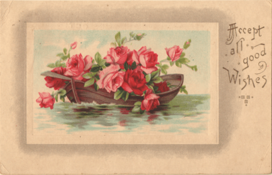
My favorite recent joke played on me by postcards is this example from earlier in the twentieth century. After trying to figure out what the sentiment was meant to be (Were they just saying “Here are my good wishes; please accept them” or did they mean “EXPECT All Good Wishes”?), I checked to see what the current market value was, and how many copies were out on the Interwebs for sale. It turns out that the company printed at least eight different versions of this card, with exactly the same frame and sentiment but different pictures of flowers in the rectangle. There are TWO, in fact, in which the flowers ride in a boat (the other one is ferrying daisies.) As I realized this, my face assumed that expression seen on the fish on those Frech April First cards. Maybe that was the point.
