I understand, honest I do. You spent a lot of time and money on your building. You’re proud of it. The architect promised this would be a building which would stand the test of time, and you want people to see it. By what right do I call the child of your corporate dreams “boring”?
Maybe I just rush to judgement. Maybe my untrained eye simply fails to see in the classic lines of your building the long meetings, the give and take of urban design, the effort and argument that went into the creation of a structure defined by its—how shall I put this—utter blandness.

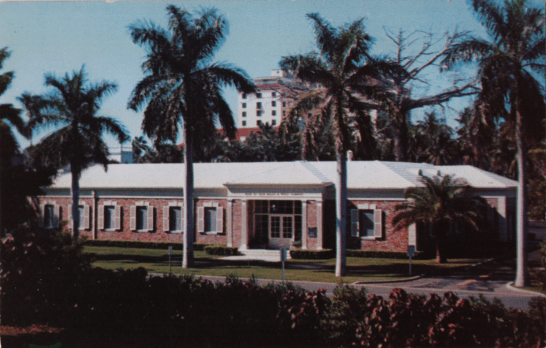
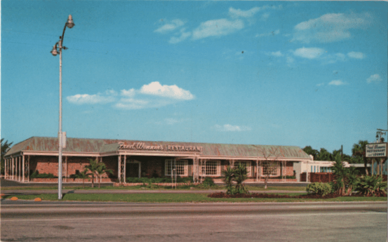
So explain it all to me? Were you responding to a trend in building styles, or rebelling against them? What was the aesthetic principle which went into designing the three buildings we have looked at so far? What is it about these buildings which should have called to my eye and brain instead of what really happened, which was that I had to flip over the postcard to learn I had just looked at a bank, a restaurant, and a hospital, in that order?

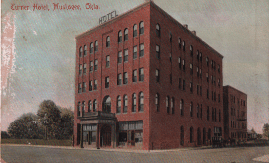
The problem isn’t just with late mid-century architecture. Buildings from earlier in the century also call up a reaction of, “Oh. A building.” Instead of “Wow! What an interesting post office!”
Would “Well, THERE’S a pile of bricks!” be enough for you?

I suppose part of the reason for printing these postcards in the first place was just to let us know what your motel looked like, so we’d know it when we drove up. At some point in any road trip, the participants reach a point at which the availability of a shower and a freshly made bed are all that matter.
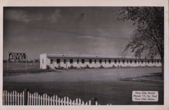
But do you HAVE to emphasize a building which would appeal ONLY to people who have been driving for fourteen hours?

Those of you who feel your building is not very interesting and instead show off the sign and the parking lot are not helping all that much.

Maybe if you just show us the entrance to your place we’ll be more engaged. AND maybe not.
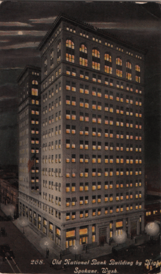
Postcard publishers are not unaware of the various problems. The Teich Company was a pioneer in taking a picture of a building and then recoloring it to make it look the way it would at night. All those lighted windows were supposed to lend the view more excitement.

This technique was still considered viable a generation later, though here we have relied on straight photography (with the result that some windows are left dark.)
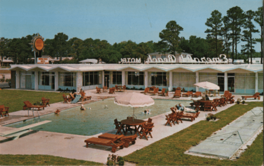
Other postcards, inspired by the building owner or the photographer, figured that if the building was not all that interesting, maybe showing off the pool would help. Another nice try.

This, by the way, also goes back to the 1930s. Even an art deco façade (and an art deco pool) could only go so far in calling to the viewer’s eye.
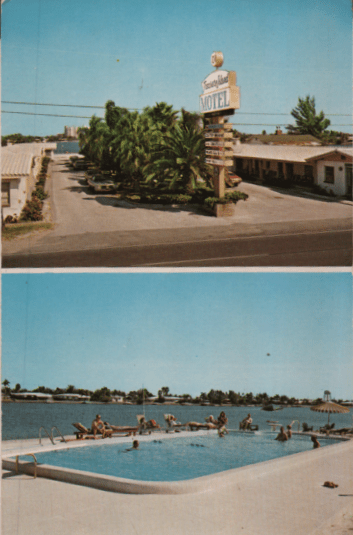
As the century went on, the double-image postcard became more popular, building both views to equal size, and treating the viewer to TWO tedious visions in place of just one.

The design, at least, is interesting. It does make us pause for a moment and marvel that somebody thought this was a really great image for a postcard.

The high point of this sort of design has to be the waterfront view, which shuts out excess appeal in favor if showing us the same building twice. At least the building management got its money’s worth on this one.
