As you will recall from our last thrilling episode, we were discussing why postcards go about with their identity emblazoned on them. My theory is that this derives from the late nineteenth century weirdness that had the U.S. Post Office selling Postal Cards while private publishers sold Private Mailing Cards or, as they came to be known, Post Cards. This lasted for half a dozen years, and the laws and prices (Postal Cards were mailed for less because you had already paid the Post office a penny to buy them) but postcards went on being labelled even after Postal Cards and Private Mailing Cards faded into the past. (There WAS a tendency among the public, which picks its own language, to refer to all these kinds of cards as “Postals” but this will send us down a whole new rabbit hole.)

In any case, publishers of postcards realized that as long as they ;eft plenty of room for an address, and reminded people that any message had to be on the other side, they could decorate the address side any way they liked.
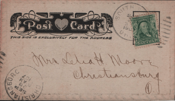
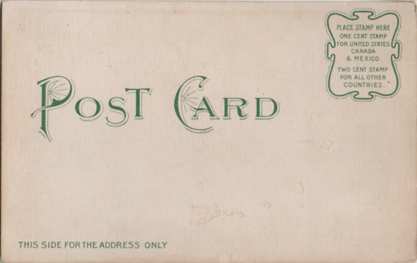
The variety of ways of simply writing “Postcard” at this point is limitless.

And some cards wound up with nearly as much picture on both sides (since the other side had to leave room at the side for the message. Remember this; it is coming back into the plot later.)
Some postcard company mascots were at least as interesting as the picture on the other side, too.

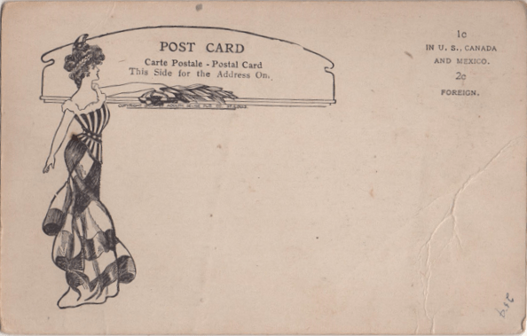
You will remember, of course, Walter Wellman, a maverick artist who published his own cards, and the heavy-haired lady he liked on the address side. As you will notice, however, this came AFTER the next big change in postcard regulation.

From 1901 to 1907, U.S. postcards were of what is called the “undivided back” variety, because the law required that the address be prominent and easy to read and separated by the card from any message. In 1907, though, the United States, finding that other countries did perfectly all right with cards that were all picture on one side, with message and address on the other (some countries issuing these cards in fact note that these could not legally be mailed in the United States), changed the rules. Now postcards had to teach the senders how to do things all over again.
Some senders never did get the hang of it, and, at first, many postcard companies adhered to an early draft of the law, which required that the message be just a teeny part of this side of the card.
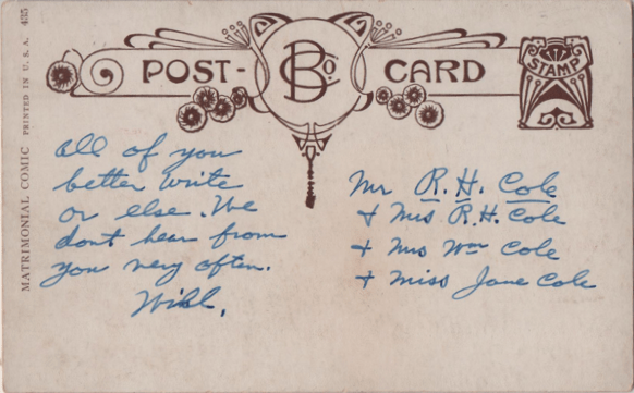
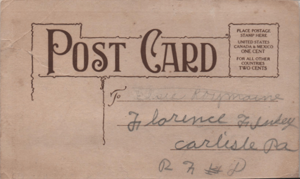
Other companies, realizing how much space they had to play with, found space for increasingly interesting trademarks. This B was made famous by Bamforth, of Holmfirth, Yorkshire and New York, New York.
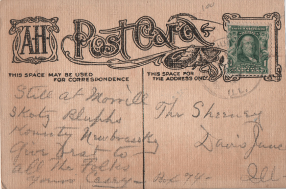
AH would later moderate the size of its trademark, so people with a lot to say would buy their cards.

The Fairman Company popularized its pink (a carnation, if you remember the flower language episodes of this column.) Valentine used a globe (to show how their cards showed so many parts of the planet.) William Wellman, as seen above, had his pompadour. Other companies, long-lived or brief flashes, had their marks and logos (and, often, a unique typeface for the words “Post Card”.)

Raphael Tuck & Sons liked to get their names in several places on the address side, along with some of the beginnings of the informational paragraph about the picture side.
This led, of course, to cards with almost no space again for a message on this side. But that phenomenon goes on to this day and is, thus, a whole nother blog.
